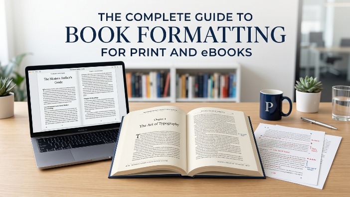
You’ve written the book. Now comes the part most authors don’t see coming, formatting. And it matters more than you think.
A reader opens your book, excited to dive in. But the text feels cramped, the chapters are misaligned, and on their Kindle, the paragraphs look like one big wall of text. They close it. Not because your writing failed them, but because the formatting did.
Book formatting is the process of preparing your manuscript’s interior layout for publication, organizing fonts, margins, spacing, chapter headings, and page flow so your content is easy, pleasant, and professional to read. It’s the invisible work that separates a published book from a self-published file.
Here’s what most new authors don’t realize:
Good formatting doesn’t get noticed. Bad formatting does.
Readers may not know what a widow line or improper gutter margin is, but they feel it. Something just seems “off.” And in today’s market, that feeling costs you reviews, ratings, and sales.
“Readers don’t consciously notice good formatting, they simply get lost in the story. That’s exactly the point.”
Formatting also looks different depending on where your book lives.
- Print book formatting deals with physical constraints page size, bleed margins, fonts that survive the printing process.
- Ebook formatting is a completely different world, with reflowable text, device compatibility, and clean HTML structure that plays nicely with Kindle, Apple Books, and Kobo.
What Is Book Formatting?

The Simple Definition
Book formatting is the process of designing and structuring your manuscript’s interior so it’s ready for publication whether that’s a physical paperback, hardcover, or a digital ebook. Think of it as the difference between handing someone a rough draft and handing them a finished, published book.
It covers everything inside the pages: typography, margins, line spacing, chapter headings, paragraph indents, page numbers, headers, footers, and how images or tables are handled. Done well, it’s completely invisible to the reader. Done poorly, it pulls them right out of the story.
Why Formatting Matters for Authors
A lot of authors pour months, sometimes years into writing their book, then rush the formatting. That’s a costly mistake.
Layout & margins – Page structure that guides the eye and respects printing or screen specs.
Typography – Font choice, size, and spacing that suits your genre and audience.
Structure & flow – Chapter breaks, front matter, back matter all in the right order.
Here’s the hard truth: retailers, reviewers, and readers all judge a book by how it looks inside.
Amazon KDP flags manuscripts that don’t meet formatting standards. Reviewers on Goodreads and NetGalley mention formatting issues in their reviews. And readers who paid for your book won’t hesitate to leave a one-star review over something as fixable as inconsistent spacing or broken chapter headings.
Professional book formatting services exist for exactly this reason because formatting is a craft of its own. It’s not just about making things look nice. It’s about meeting platform requirements, matching genre expectations, and giving your reader a seamless experience from page one to the end.
“Formatting is the last mile of writing. You ran the whole race, don’t trip at the finish line.”
How Proper Formatting Improves Reader Experience
Readers don’t think about formatting and that’s exactly the goal. When your book is formatted correctly, they just read. The words flow. The pages turn. Nothing interrupts the experience.
But when formatting is off? They notice. Text that’s too small, lines that are too tight, or chapters that start halfway down a page all create tiny moments of friction. Multiply those moments across an entire book and you’ve got a reader who feels vaguely frustrated and doesn’t know why.
Proper formatting also signals credibility. A well-formatted book tells the reader and the algorithm that you took this seriously. It builds trust before a single sentence is read. That matters more in self-publishing, where readers don’t always have a traditional publisher’s name as a quality signal.
Why Book Formatting Is Important Before Publishing
Skipping proper formatting before you hit publish is like handing in a job application with coffee stains on it. The content might be great but the presentation has already made an impression. And in publishing, first impressions are everything.
Here’s why formatting isn’t optional, it’s foundational.
It Creates a Professional Appearance
Readers have standards, even when they can’t articulate them. They’ve grown up reading traditionally published books, books that were designed by professionals who knew exactly how a page should breathe, where a chapter should begin, and which fonts belong in which genres.
When your book looks and feels like those books, readers trust it. When it doesn’t, something feels amateur, even if your writing is excellent. Professional book formatting services bring that same level of design precision to your manuscript, so it stands shoulder to shoulder with anything on a bookstore shelf.
- First impression in seconds
- Signals quality before page one
- Matches genre expectations
- Builds reader trust instantly
It Improves Readability
Readability isn’t just about how good your sentences are, it’s about how easy they are to physically consume on a page. Line spacing that’s too tight makes reading exhausting. Margins that are too narrow feel claustrophobic. A font that works on a screen may be completely wrong in print.
Proper formatting controls all of this. It creates a rhythm on the page, one the reader’s eye follows naturally, without effort. That ease is what keeps someone reading for hours. It’s not magic. It’s good formatting.
“The best-formatted books are the ones where readers finish the last page and never once thought about how it looked because it never gave them a reason to.”
It Meets Publishing Platform Requirements
Every major publishing platform has its own set of publishing standards like specific file types, margin specs, image resolutions, font embedding rules, and metadata requirements. Submit a file that doesn’t meet them and your book gets rejected, delayed, or published with errors you won’t even see until a reader complains.
- Amazon KDP – Requires specific margin sizes, embedded fonts, and proper reflowable structure for Kindle devices.
- IngramSpark – Strict PDF specs for print bleed, trim size, color profiles, and spine width all have to be exact.
- Apple Books & Kobo – EPUB formatting standards that control how your book renders across different screen sizes and devices.
Good book formatting services know these requirements inside out and they format your manuscript to pass, not just submit.
It Reduces Publishing Errors
Formatting errors are the kind that don’t show up until it’s too late. A missing page break turns two chapters into one. An unembedded font displays as gibberish on certain devices. A wrong trim size gets your print proof rejected after you’ve already shared the link.
These aren’t writing mistakes, they’re technical ones. And they’re completely avoidable with a proper formatting process. Whether you use a professional or do it yourself with a solid checklist, catching these issues before publication saves you time, money, and a lot of unnecessary frustration.
Understanding the Difference Between Print and eBook Formatting
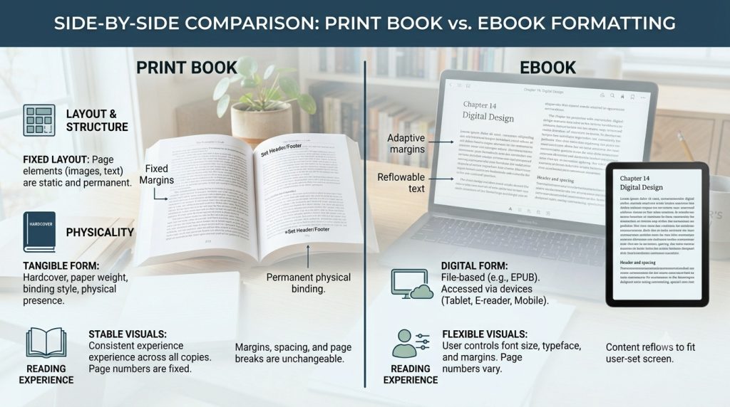
Here’s something that surprises a lot of first-time authors: you can’t use the same file for print and digital. A beautifully formatted print book will look broken on a Kindle. And an ebook file sent to a printer will come back rejected. They’re two entirely different formats, built for two entirely different reading experiences.
Understanding how they differ isn’t just useful, it saves you from expensive, time-consuming mistakes down the road.
Print Book Formatting Explained
Print book formatting is about working within fixed, physical constraints. Every decision you make including page size, margin width, font choice, image resolution has to account for how ink lands on paper and how pages are bound together.
The trim size (6×9, 5.5×8.5, and so on) determines everything else. Your margins need to account for the gutter the inner edge lost to binding. Your images need to be 300 DPI minimum. Your fonts need to be embedded in the final PDF. Miss any of these and your printer or POD platform will reject the file, or worse, print it wrong.
Print formatting is precise work. It rewards patience and punishes guesswork.
Print essentials – What gets locked in:
- Trim size & page dimensions
- Gutter & outer margins
- 300 DPI image resolution
- Embedded fonts in PDF
- Bleed settings for cover art
Common trim sizes – Genre standards
- 5×8 — poetry, short fiction
- 5.5×8.5 — novels, memoirs
- 6×9 — nonfiction, business
- 8.5×11 — textbooks, workbooks
- 8×10 — children’s, illustrated
eBook Formatting Explained
Ebook formatting is a different discipline entirely. Where print is fixed and rigid, ebooks are fluid. Your text needs to reflow and adapt to whatever device, screen size, or font setting the reader chooses. Someone reading on an iPhone in large text, someone else on a Kindle Paperwhite in the default view, your book needs to look right for both of them.
The backbone of most ebooks is EPUB, a format built on HTML and CSS. What this means practically is that clean, well-structured source files matter enormously. Messy Word documents with manual spacing, tab indents, and scattered formatting overrides will produce broken ebooks that look different on every device.
Good ebook layout formatting strips out the clutter, builds a logical structure, and lets the reading device do its job.
“An ebook isn’t a scanned page, it’s a structured document. The cleaner your source file, the better your ebook behaves across every platform.”
Fixed Layout vs Reflowable Layout
Within ebook formatting, there are two distinct approaches and choosing the wrong one for your book type is a common, costly mistake.
Option A
Fixed layout: Every element stays exactly where you place it images, text boxes, design elements. The page looks the same on every device, like a PDF.
Best for: Children’s books, cookbooks, art books, heavily illustrated titles.
Option B
Reflowable layout: Text adapts to the screen and reader settings. Font size, line spacing, and margins adjust automatically per device.
Best for: Novels, nonfiction, memoirs, business books any text-heavy title.
Common Formatting Challenges
Whether you’re formatting for print or digital, a few challenges show up again and again, especially for authors doing it themselves for the first time.
- Images breaking on digital devices
High-res images needed for print are often too large for ebooks and cause rendering issues across devices. - Carrying over Word formatting errors
Manual tabs, multiple spaces, and inconsistent styles from Word get baked into ebook files and appear as broken formatting. - Fonts not rendering correctly in print
Fonts must be properly embedded in your print PDF. Unembedded fonts default to a generic substitute, often with ugly results. - Table of contents not linking in ebooks
A print-style TOC won’t function in a digital book. Ebooks need a navigational TOC with active hyperlinks built into the structure.
Front matter
01) Title page – First impression, sets the tone
02) Copyright page – Legal protection & edition info
03) Table of contents – Navigation — critical for ebooks
Main content
04) Chapter headings – Structure & visual hierarchy
05) Headers & footers – Running title, author name, orientation
06) Page numbers – Consistent numbering system
07) Images & graphics – Resolution, placement, captioning
Back matter
08) Back matter – About the author, resources, index
Title Page
Your title page is the first real page a reader sees and it carries more weight than most authors give it. It’s not just your book’s name. It’s where the title, subtitle, author name, and publisher information all live together. In a well-designed book layout, the title page sets the visual tone for everything that follows. Typography, spacing, and alignment here telegraph whether this is a polished book or a rushed one.
The copyright page sits on the reverse of the title page and is one of the most overlooked and most important pages in any book. It’s your legal record: copyright notice, edition year, ISBN, Library of Congress information, and any rights or permissions language. Skipping it or getting it wrong doesn’t just look unprofessional. It leaves your work legally exposed.
Copyright Page
Quick tip: Always include your ISBN on the copyright page, even for ebooks. Each format (paperback, hardcover, Kindle) should have its own unique ISBN.
Table of Contents
In a print book, the table of contents is a navigational courtesy. In an ebook, it’s a functional requirement. Ebook platforms including Kindle and Apple Books require a clickable, hyperlinked TOC that lets readers jump directly to any chapter. A print-style TOC copied into a digital file won’t work. It needs to be built into the file’s structure from the ground up.
For nonfiction especially, a clear TOC signals that your book is organized, thoughtful, and reader-first — which affects how potential buyers judge it before they even open the first chapter.
Chapter Headings
Chapter formatting creates the visual rhythm of your book. Every chapter opening should feel intentional consistent drop space from the top of the page, a heading style that matches your genre, and a clear break from what came before. Fiction typically uses elegant, minimal headings. Nonfiction often benefits from more structured, descriptive titles. Neither is wrong inconsistency is.
Fiction standard
Simple numerals or chapter names, generous top drop, clean serif font
Nonfiction standard
Descriptive titles, subtitle option, section numbers where helpful
Page Numbers
Page numbering has its own rules and getting them wrong is one of the most noticeable formatting errors in print books. Front matter (title page, copyright, TOC) traditionally uses Roman numerals or no numbers at all. The main text begins at page 1. Chapter opening pages typically suppress the page number. Headers and footers carry the numbers through and they should never appear on blank pages.
It’s a small detail that readers notice immediately when it’s wrong and never think about when it’s right.
Headers and Footers
Running headers and footers orient the reader throughout your book. A typical setup: the author name on the left page, the book title on the right. Some nonfiction books use chapter titles in the header to help readers track where they are in a longer work. In ebooks, headers and footers work differently most reading devices handle navigation separately, so these elements are often omitted in digital formatting entirely.
Images and Graphics
Images need different treatment depending on the format. Print requires a minimum of 300 DPI anything lower looks blurry on paper. Ebooks are far more forgiving on resolution but much stricter on file size; large, unoptimized images cause slow loading and can even crash older reading devices. Captions should be styled consistently, and image placement needs to be anchored properly so text wraps correctly especially in reflowable ebook layouts, where images can drift unpredictably if not handled carefully.
Front Matter and Back Matter
Front matter sets the stage before chapter one dedications, forewords, prefaces, acknowledgments. Back matter closes it out, about the author, bibliography, index, discussion questions, and calls to action like newsletter signups or links to your other books. Neither section is filler. Back matter in particular is valuable real estate: it’s where engaged readers go next, and where smart authors direct them.
“Every page in a well-formatted book has a reason to exist. Front matter builds credibility. Main content delivers the promise. Back matter earns the next sale.”
Remember: Professional book layout design isn’t about decoration it’s about function. Each of these elements exists to serve the reader and protect the author. Get them right, and your book earns the trust it deserves.
How to Format a Book for Print
Print book formatting is where technical precision meets design judgment. Get the specs right and your book comes back from the printer exactly as intended. Get them wrong and you’re paying for reprints, resubmitting files, and delaying your launch. Here’s what to nail from the start.
Choosing the Right Trim Size
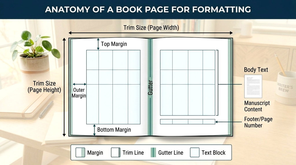
Trim size is the finished dimension of your book after printing and cutting and it’s one of the first decisions you’ll make. It affects your page count, your spine width, your unit cost, and how your book sits on a shelf next to comparable titles. Print book formatting requirements vary by genre, so matching your trim to reader expectations matters.
| 5 × 8″ | Poetry, novellas | Compact, intimate feel |
| 5.5 × 8.5″ | Novels, memoirs | Most common fiction size |
| 6 × 9″ | Nonfiction, business | Standard nonfiction trim |
| 7 × 10″ | Textbooks, workbooks | More visual real estate |
| 8.5 × 11″ | Activity books, large format | Landscape-friendly |
Setting Margins and Gutters
Margins aren’t just white space they’re breathing room. Too narrow and the page feels suffocating. Too wide and it wastes paper, inflates page count, and raises printing costs. The gutter (inner margin) needs extra space to account for the binding otherwise text disappears into the spine where readers can’t reach it.
Top margin 0.75″ Standard for most titles
Bottom margin 0.75″ Slightly larger if using page numbers here
Outside margin 0.5 – 0.75″ Reader’s thumb space
Gutter (inner) 0.875 – 1” Add extra for thicker books (300+ pages)
Selecting Fonts and Typography
Font choice shapes how your book feels before the reader processes a single word. Body text should always be a readable serif, sans serifs tire the eye over long reading sessions. Ideal body font size is 10–12pt depending on the font’s x-height. Headings can go bolder and more expressive, but should always complement rather than fight the body font.
Fiction:
Garamond, Caslon, Palatino, Minion Pro
Avoid: Times New Roman (too default)
Nonfiction
Baskerville, Cambria, Bookman, Warnock Pro
Avoid: Arial, Helvetica (screen fonts)
Children’s books
Myriad Pro, Gill Sans, Futura, Century Schoolbook
Avoid: decorative scripts (hard to decode)
Academic / textbooks
Sabon, Utopia, Charter, Stone Serif
Avoid: novelty display fonts
Adjusting Line Spacing and Paragraphs
Line spacing or leading controls how much air sits between lines of text. Too tight and the eye struggles to track from line to line. Too loose and the page looks empty and unfinished. A general rule: set leading at 120–145% of your font size. A 11pt font works well at 13–15pt leading.
For paragraphs, use first-line indents (0.2–0.3″) rather than space-between paragraphs for fiction. Nonfiction can go either way, but be consistent throughout mixing both styles on the same page is a dead giveaway of amateur formatting.
Preparing Print-Ready PDF Files
The final step before submitting to a printer or POD platform is exporting a print-ready PDF and this step has more ways to go wrong than any other. Your PDF needs embedded fonts, correct color profiles (CMYK for color books, grayscale for black-and-white), proper bleed settings if your cover or any interior elements extend to the page edge, and the exact trim size baked into the document settings.
How to Format an eBook
Ebook formatting has its own rules and they’re different enough from print that many authors get tripped up trying to adapt the same file. The goal here isn’t a fixed, designed page. It’s a clean, flexible document that reads beautifully on any screen, any device, any font setting. Here’s how to get there.
Understanding EPUB and Kindle Formats
Most ebook platforms run on two core formats. Understanding which does what and where they’re accepted — is the starting point for ebook formatting for Kindle and beyond.
Format 1
EPUB
The universal ebook standard. Used by Apple Books, Kobo, Barnes & Noble, Google Play, and most other platforms. Built on HTML/CSS clean structure is essential.
Format 2
MOBI / KFX
Amazon’s proprietary format for Kindle devices. KDP now accepts EPUB and converts it automatically but a clean source file produces a much better conversion.
The practical takeaway: start with a well structured EPUB. It’s the format that gives you the most control and the widest platform reach. Amazon will handle the conversion on their end.
Creating a Clickable Table of Contents
An ebook’s table of contents isn’t decoration it’s infrastructure. Kindle and Apple Books both require a navigational TOC embedded in the file’s structure, separate from any visual TOC you include as a content page. Each chapter link must be anchored to the actual chapter heading, not to a page number (ebooks don’t have fixed pages). If the links don’t work, the platform may flag your file or readers will leave a negative review about navigation.
“A broken table of contents in an ebook is like a broken elevator in a building. Technically the stairs exist — but nobody’s happy about it.”
Optimizing Images for eBooks
Images in ebooks need to be optimized differently than print. Resolution can drop to 72–150 DPI since screens don’t need the same density as paper. More importantly, file size needs to stay lean, Amazon KDP has a delivery cost tied to file size, and oversized image files eat into your royalties with every download. Compress your images, use JPEG for photos and PNG for graphics with transparency, and always test how they display on an actual device before you publish.
Testing Across Different Devices
One of the most skipped steps in ebook formatting and one of the most important. Your ebook will look different on a Kindle Paperwhite, an iPad, an Android tablet, and a phone. Font scaling, image placement, and chapter breaks can all behave unexpectedly across reading environments. Test on as many as you can before you publish or use a tool like Kindle Previewer and Adobe Digital Editions to simulate them.
Kindle e-ink
Most common; check font scaling and image placement
iPad / tablet
Color renders here; test images and layout width
Smartphone
Narrow screen; check line breaks and TOC links
Desktop app
Kindle for PC/Mac, wide viewport, different reflow
Preparing Files for Amazon KDP
Formatting a book for Amazon KDP comes with its own checklist. KDP accepts EPUB, DOCX, and a few other formats but EPUB gives you the most control over the final output. Before you upload, run through these essentials:
- EPUB file validated with no critical errors (use EPUBCheck)
- Navigational TOC embedded and all chapter links active
- Cover image included separately as a high-res JPEG (2,560 × 1,600px minimum)
- No manual page breaks between every paragraph (common Word export issue)
- Images compressed and total file size under 50MB
- Previewed in Kindle Previewer before submission
- Metadata (title, author, language) matches your KDP dashboard exactly
One last thing: KDP’s automatic file conversion is convenient, but it’s not perfect. The cleaner your source EPUB, the better your Kindle book looks on every device, for every reader who buys it.
Common Book Formatting Mistakes to Avoid
Even experienced authors make formatting mistakes usually because formatting is the last thing on their mind after finishing a manuscript. These are the ones that show up most often, the ones readers and reviewers actually notice, and the ones that are entirely preventable.
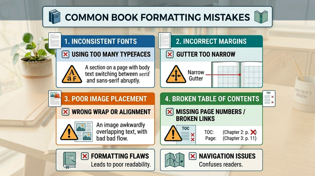
Inconsistent Fonts
This is the most common and most visible formatting mistake in self-published books. It usually happens when a manuscript is assembled from multiple drafts, edited across different devices, or copy-pasted from various sources. Each chunk brings its own hidden font data, and suddenly your body text is alternating between two similar but not identical typefaces. Readers can’t always name it, but they feel the inconsistency as a low-grade irritation throughout the book.
The fix: Before formatting begins, run a global “clear all formatting” pass on your manuscript. Select everything, reset to your chosen body font, then apply heading styles from scratch. Never copy-paste formatted text from outside sources.
Incorrect Margins
Margins that are too narrow make a book physically uncomfortable to hold your thumbs cover the text. Margins that ignore the gutter push words into the spine where they disappear into the binding. Both are dead giveaways of a book that wasn’t formatted with publishing standards in mind. For print, always account for the inner margin separately from the outer, and add extra gutter space for books over 200 pages.
Poor Image Placement
Images that float away from their captions, sit awkwardly between sentences, or stretch beyond the text area are a formatting problem not a design choice. In print, images need to be anchored to the correct position on the page. In ebooks, they need to be set as block elements so they don’t get trapped mid paragraph when text reflows on a small screen. Low-resolution images are equally problematic blurry photos in a printed book look careless, regardless of how good the writing is.
Broken eBook Navigation
A non-functioning table of contents is one of the most-cited complaints in ebook reviews and it’s 100% avoidable. Broken navigation usually comes from exporting a Word document directly to EPUB without rebuilding the TOC structure, or from using page number based links instead of anchor links. Amazon’s Kindle Quality Notice system will flag it. Readers will flag it louder.
TOC links pointing to wrong chapters
Fix: Rebuild anchor links from scratch in your EPUB editor don’t rely on Word’s auto generated TOC.
No navigational TOC in the file metadata
Fix: Add an NCX or Nav document to your EPUB this is what Kindle and Apple Books use for device navigation.
TOC only exists as a content page, not a nav element
Fix: You need both a visual TOC page for readers and a structural nav TOC for the device. They’re different things.
Skipping Proof Checks
Skipping the proof is the formatting equivalent of sending an email without reading it back. Formatting errors that are invisible in your design software become obvious the moment a file is converted and displayed on a real device or printed on real paper. Widows and orphans, blank pages in the wrong places, missing headers, misaligned images all of these can sneak through a file that looked perfect on screen.
Order a physical proof copy for every print book. Use Kindle Previewer for every ebook. Read through at least the first and last page of every chapter. It takes an hour and saves you from a mistake that could sit in your published book for years.
Tools and Software Used for Book Formatting
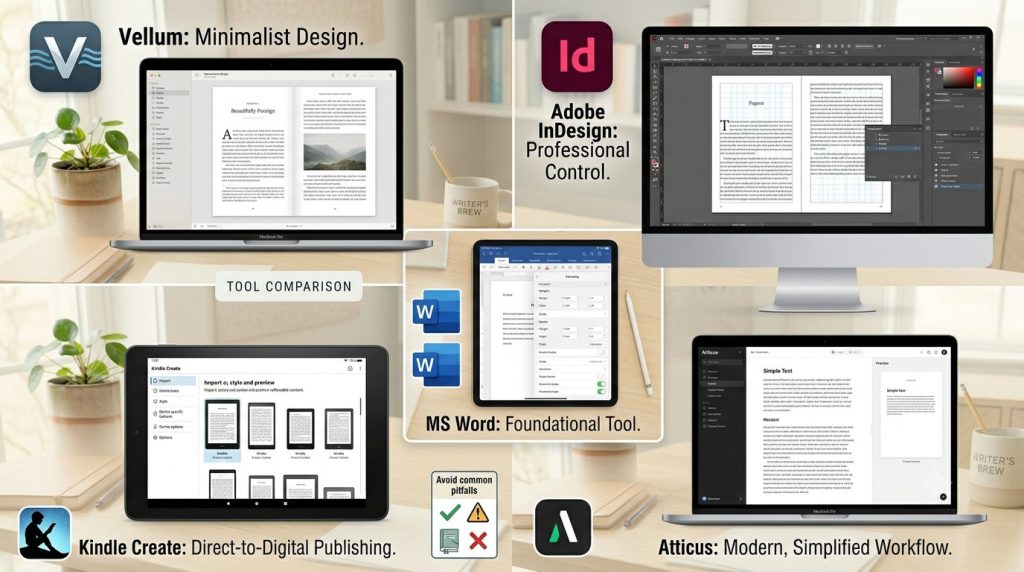
The right book formatting software makes an enormous difference the wrong one turns a straightforward task into a frustrating battle. Here are the most widely used tools in the industry, what they’re genuinely good at, and who they’re actually built for.
Microsoft Word
Word is where most manuscripts begin and for simple, text-only books it can handle basic formatting adequately. KDP accepts .docx files directly, which makes it the path of least resistance for many first-time authors.
Adobe InDesign
The industry standard for professional book layout design. InDesign gives you complete control over every element on the page typography, image placement, paragraph styles, master pages, and print-ready PDF export. It’s what most professional formatters and traditional publishers use.
Vellum
Vellum is widely regarded as the best ebook formatting tool for indie authors on Mac. It produces beautiful, clean output for both print and digital with minimal effort. Import your Word doc, choose a style, and export. The results look genuinely professional with very little setup time.
Atticus
Built specifically for self-published authors, Atticus functions as both a writing and formatting tool. It works on Windows and Mac, produces clean EPUB and print-ready PDF files, and has been rapidly improving since launch. A direct Vellum competitor with cross-platform support.
Kindle Create
Amazon’s free formatting tool designed exclusively for Kindle publishing. It imports Word documents and helps you style chapters, front matter, and basic layout for KDP submission. Simple, guided, and free but limited to Kindle output only.
Frequently Asked Questions
The cost of book formatting varies depending on factors such as the book’s length, complexity, number of images, and whether you need formatting for print, eBook, or both. Simple projects may cost less, while books with custom layouts, graphics, tables, or specialized formatting requirements typically require a larger investment. Professional book formatting services help ensure your manuscript meets publishing standards and provides readers with a polished experience.
Yes, authors can format their own books using tools such as Microsoft Word, Kindle Create, Atticus, or Adobe InDesign. However, DIY formatting often requires time, technical knowledge, and familiarity with publishing guidelines. Many self published authors choose professional book formatting services to avoid costly mistakes, ensure consistency, and save valuable time.
The most widely accepted eBook format is EPUB, which is compatible with most eReaders and publishing platforms. Amazon Kindle uses its own formats, but EPUB files can often be converted for Kindle publishing. The best format depends on where you plan to distribute your eBook, but EPUB remains the industry standard for flexibility and compatibility.
To format a book for Amazon KDP, you’ll need to follow Amazon’s guidelines for page size, margins, fonts, image placement, and file types. Print books are typically uploaded as print ready PDFs, while eBooks require properly structured EPUB or Kindle compatible files. It’s also important to create a clickable table of contents, maintain consistent chapter formatting, and test your files before publishing.
Book formatting focuses on organizing and structuring the interior of a book to ensure readability and compliance with publishing standards. This includes margins, fonts, chapter headings, spacing, page numbers, and layout consistency. Book design is a broader process that includes visual and aesthetic elements such as cover design, typography choices, and overall branding. Both play important roles in creating a professional-quality publication.
The timeline for book formatting depends on the manuscript’s length, complexity, and formatting requirements. A straightforward manuscript may take only a few days, while books with images, charts, tables, or custom layouts may require additional time. Working with experienced formatting professionals can help streamline the process and ensure accuracy before publication.
Conclusion
Book formatting is one of the most important steps in the publishing process. Whether you’re preparing a printed book, an eBook, or both, proper formatting ensures your work looks professional, meets industry standards, and delivers an enjoyable reading experience.
At Liberty Book Writers, we help authors transform manuscripts into professionally formatted print books and eBooks that are ready for publication. Whether you’re self-publishing your first book or preparing your next bestseller, our team can help ensure your book meets the highest publishing standards.
Turn Your Manuscript Into a Reader-Ready Book
Even the best story can lose readers if the formatting isn’t professional. Margins, fonts, chapter headings – these details affect how your book is perceived and enjoyed. At Liberty Book Writers, we help authors format their manuscripts for both print and eBooks, creating a polished, seamless reading experience across all platforms.
Professional Formatting for Print and eBooks
Your manuscript is complete. Now let’s make it reader-ready and professional. Share your details, and our team will handle formatting for Amazon KDP, IngramSpark, Apple Books, and Kobo, ensuring your book looks polished and ready for readers.